 Help Center
Truncated bar chart in Excel tutorial
This tutorial explains how to generate and interpret a truncated bar chart in Excel using the statistical software XLSTAT.
What is a truncated bar chart?
Bar charts are very useful for visualizing categorical distributions where each bar represents the frequency of a particular category.
However, it can happen that there is too much of a difference between the various frequencies. For example, we may have one category with 20 000 individuals (observations) and two categories with 400 and 500 individuals respectively. In this case, the y-axis will be scaled in a way that it clearly shows the bar of 20 000 observations but it will difficult to visualize the other two categories. This is why we should, with no loss of information, truncate the first bar.
Creating such a bar chart in Excel can be cumbersome while you can easily do it with XLSTAT. Furthermore, XLSTAT allows to use transparency to partly show the information that is hidden in the removed or squeezed part of the scale.
Dataset for creating a truncated bar chart
The original data come from the kaggle.net website and contain the results from the Boston 2019 marathon. Several variables are available such as the Rank, Age, Gender, Country, Result (time) and Country code. Only Gender will be used as an explanatory variable.
Result (time), our response variable, has been split into three categories and renamed into Category:
- Category 1: runners who finished the marathon in less than 3 hours
- Category 2: runners who crossed the finish line in 3 to 4.5 hours
- Category 3: runners who finished the marathon in more than 4.5 hours
Aim of this tutorial
The aim of this tutorial is to visualize the distribution of the 2019 Boston marathon results as well as to link the performance to the gender of participants.
Setting up a truncated bar chart in XLSTAT
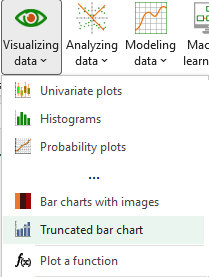
Once XLSTAT is open, click on Visualizing data / Truncated bar chart as shown below:
The Truncated bar chart dialog box appears.
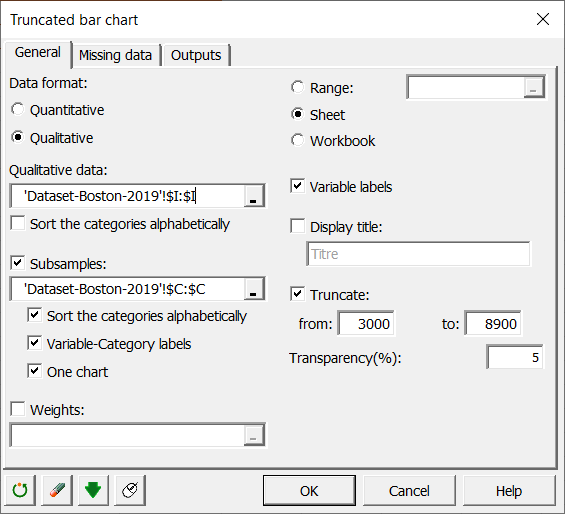 In the General tab, choose the type of the variable you want to visualize in the Data format field. In this example, choose Qualitative and select column I (Category) in the demo data file.
Select the Gender variable (column C) in the Subsamples field in order to visualize the runners’ performance separately for female and male participants. You can choose to sort your modalities by alphabetical order, specify the Variable-Category labels (to add a legend to the plot with « Gender-F » and « Gender-M ») and check One chart to plot all three modalities on the same bar chart.
Activate the Truncate option and choose at which level you want to truncate. The transparency (%) option allows you to set the transparency of the squeezed part of the chart. Set 0 to completely hide it, or 100 to make it fully visible.
Interpret a truncated bar chart
If we plot the raw data using a normal bar chart, we’ll get the following visualization:
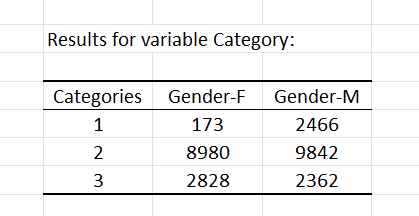
As we can see, most of the data belongs to category 2 and is above 8 000 units. This is also confirmed by the summary statistics table.
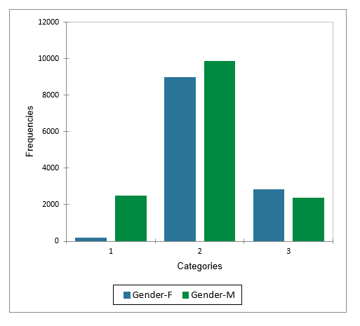
However, it’s almost impossible to read the values for Category 1 – Gender F on that graph. What we need is a truncated bar chart to be able to see both the information at the bottom of the scale and at the top. Following the instructions of the previous section, we’ll get something like this:
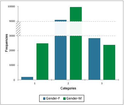 Thanks to the truncation, we can now observe the frequencies with more precision and compare the different categories since the bars are no longer crushed by the scale of the y-axis.
Conclusion
We initially saw that Category 2 made the scale go up which made one of the extremes not readable. Using the truncated bar chart, we removed this effect and saw most of the detail clearly.
Was this article useful?
- Yes
- No