 Help Center
Agglomerative Hierarchical Clustering (AHC) in Excel
This tutorial will help you set up and interpret an Agglomerative Hierarchical Clustering (AHC) in Excel using the XLSTAT software.
Dataset to run an Agglomerative Hierarchical Clustering in XLSTAT
An Excel sheet with both the data and the results can be downloaded by clicking on the link given at the beginning of this tutorial.
The data are from the US Census Bureau and describe the changes in the population of 51 states between 2000 and 2001. The initial dataset has been transformed to rates per 1000 inhabitants, with the data for 2001 serving as the focus for the analysis. Our aim is to create homogeneous clusters of states based on the demographic data we have available.
Setting up an Agglomerative Hierarchical Clustering
Once XLSTAT-Pro is activated, go to XLSTAT / Analyzing data / Agglomerative Hierarchical Clustering.
The Hierarchical Clustering dialog box will appear. Then select the data on the Excel sheet.
Note: There are several ways of selecting data with XLSTAT - for further information, please check the section on selecting data in the XLSTAT tutorial.
In this example, the data start from the first row, so it is quicker and easier to use columns selection. This explains why the letters corresponding to the columns are displayed in the selection boxes. The "Total population" variable was not selected, as we are interested mainly in the demographic dynamics. The last column was not selected as it is fully correlated with the column preceding it.
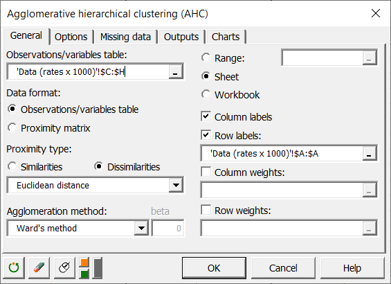
In the Options tab, the Center/Reduce options were selected to avoid having group creation influenced by scaling effects.
We selected the automatic truncation option, so that the results show the groups to which each observation belongs. The automatic truncation is based on the entropy and tries to create homogeneous groups. However it should not prevent you from using a different number of groups either because of operational constraints, or because of your prior knowledge.

The computations begin once you have clicked on OK.
Interpreting the results of an Agglomerative Hierarchical Clustering
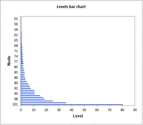
The first result to look at is the levels bar chart. The shape reveals a great deal about the structure of the data. When the increase in dissimilarity level is strong, we have reached a level where we are grouping groups that are already homogenous. Automatic truncation uses this criterion to decide when to stop aggregating observations (or groups of observations).
The chart below is the dendrogram. It represents how the algorithm works to group the observations, then the subgroups of observations. As you can see, the algorithm has successfully grouped all the observations. The dotted line represents the automatic truncation, leading to two groups.
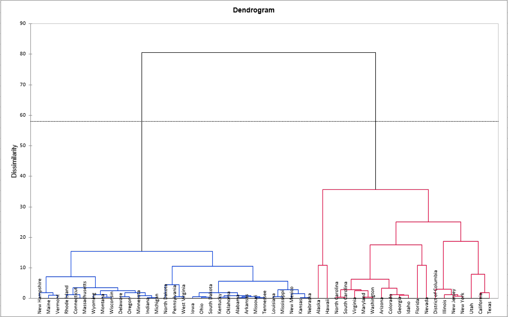
The first group (displayed in blue color) is more homogeneous than the second one (it is flatter on the dendrogram). This is confirmed when looking at the Within-class variance. It is a lot higher for the second group than for the first one.
The following table shows the states that have been classified into each cluster.
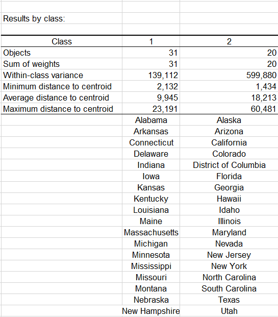
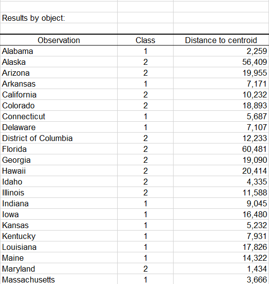
A table with the class ID for each State is displayed on the results sheet. A sample is shown below. This table is useful as it can be merged with the initial table for further analyses, for example, discriminant analysis or parallel coordinates plot.
This video shows how to do this tutorial.
Was this article useful?
- Yes
- No